Graphics with ggplot2
STAT 220
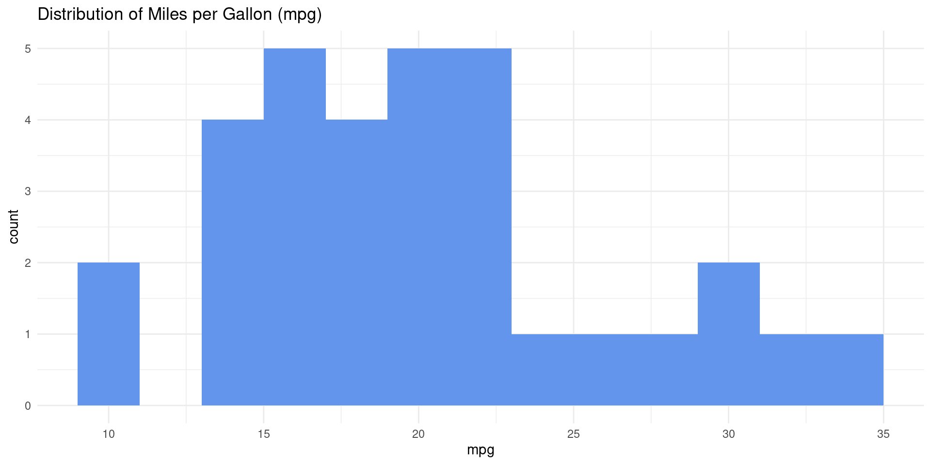
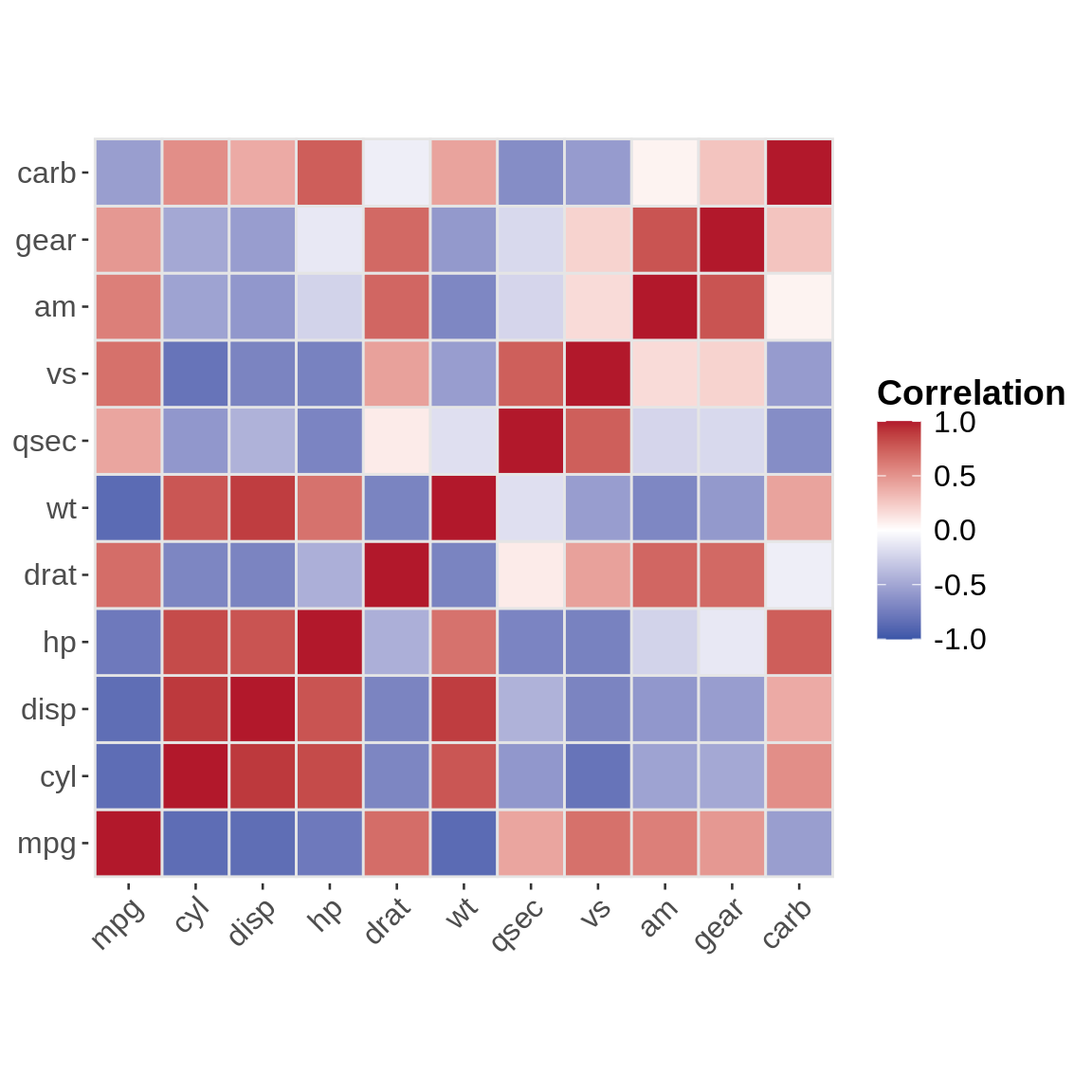
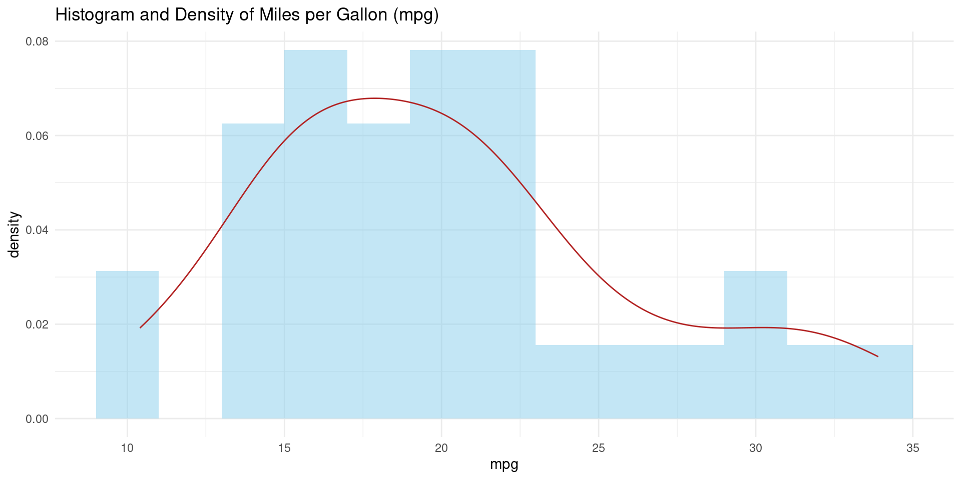
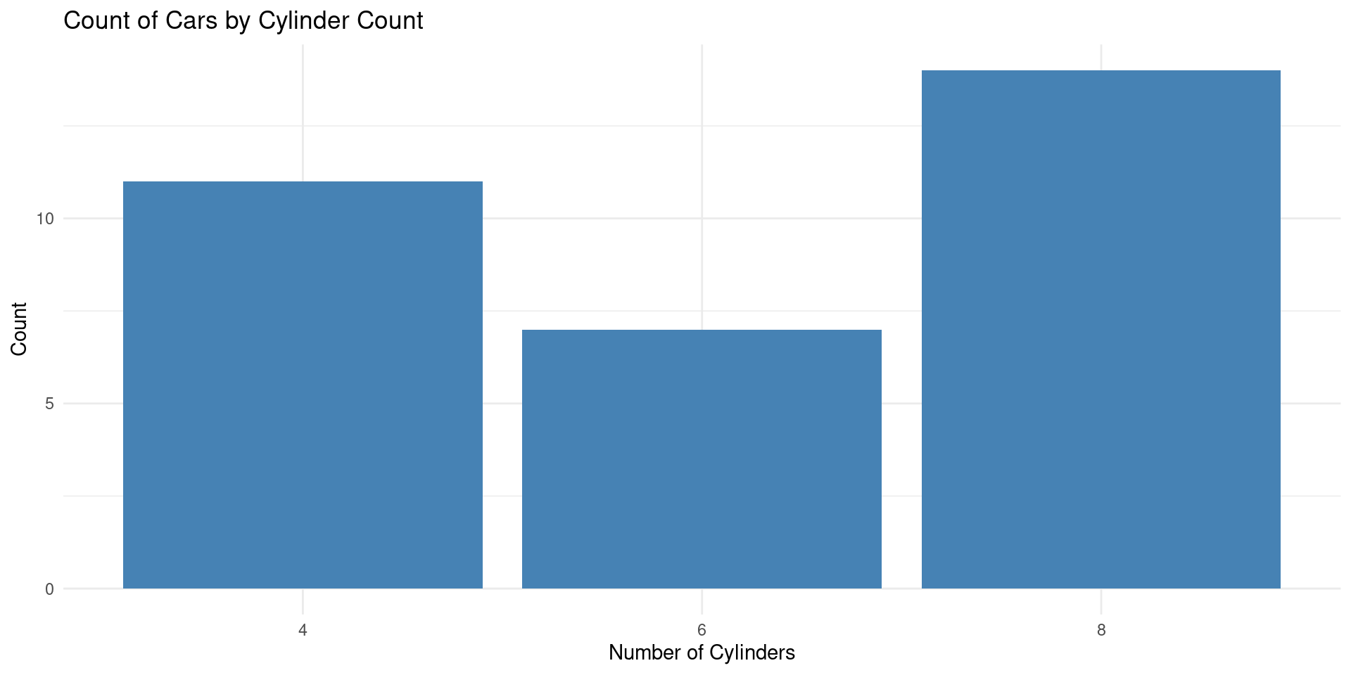
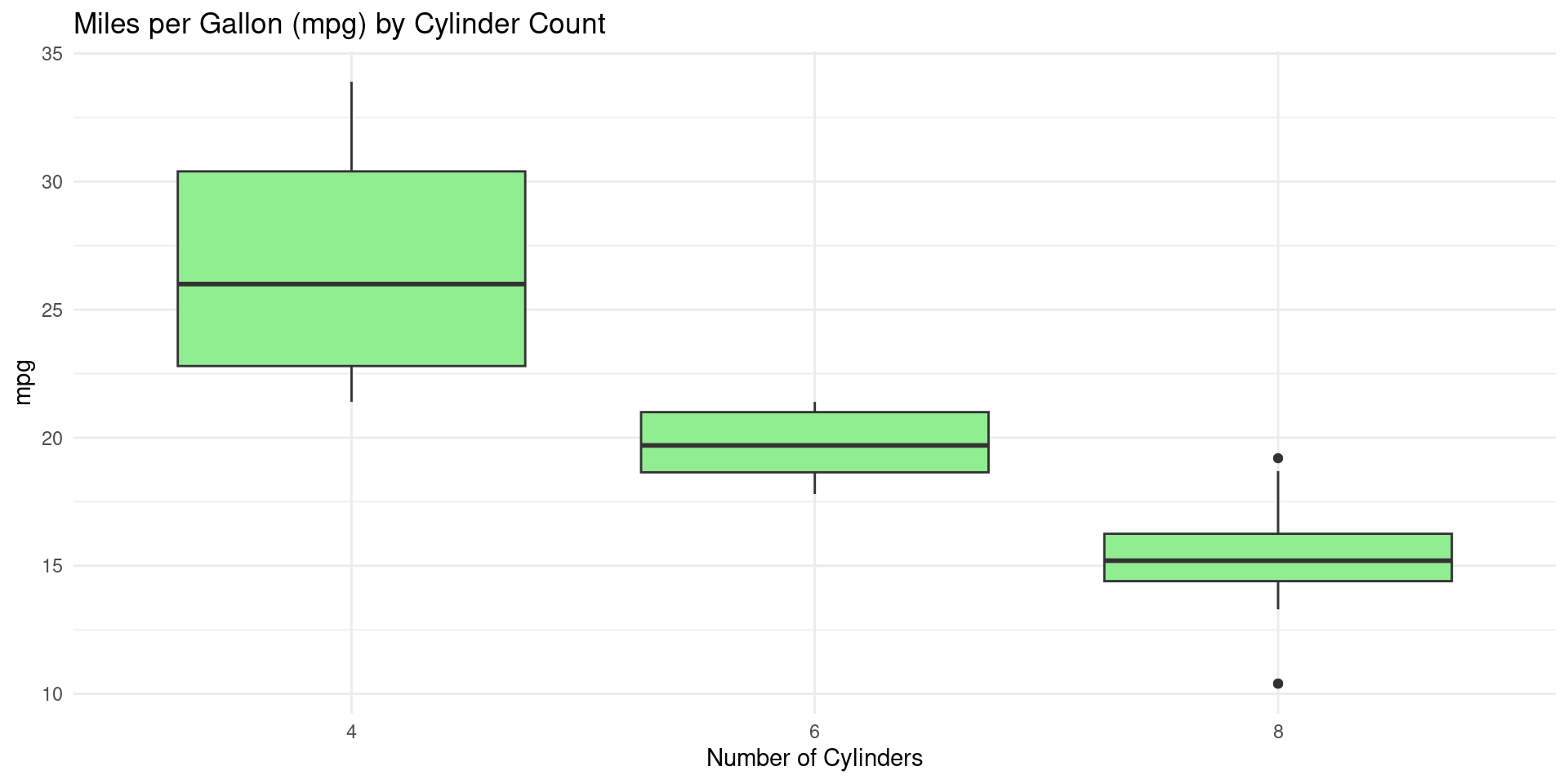
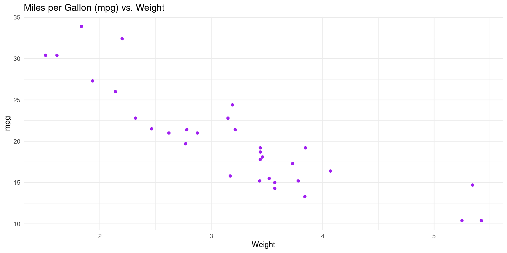
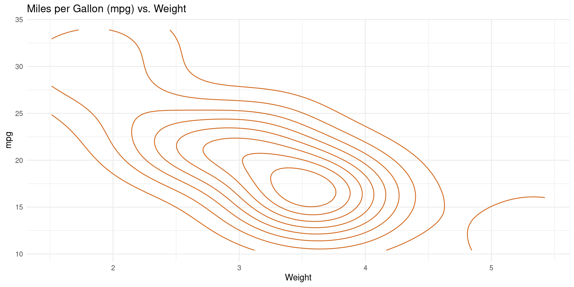
Which visualization do you prefer?
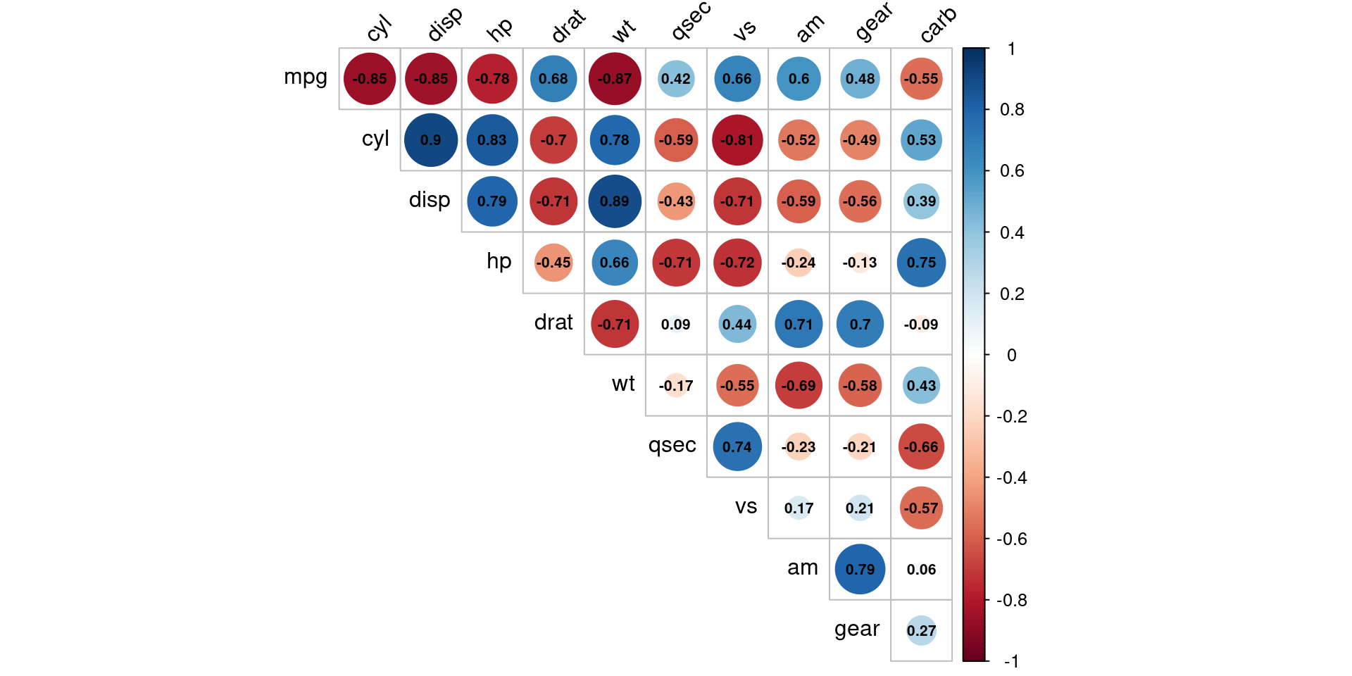
Which visualization do you prefer?
Example Visualization 2
Example Visualization 3
Example Visualization 4
Example Visualization 5
Example Visualization 6
Example Visualization 7
Example Visualization 8
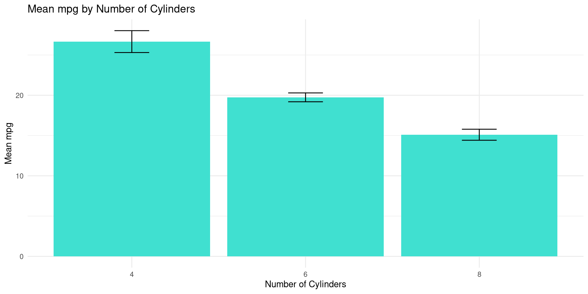
# Error bars for mpg by number of cylinders in the mtcars dataset
ggplot(mtcars, aes(x = factor(cyl), y = mpg)) +
  geom_bar(stat = "summary", fun = "mean", fill = "turquoise") +
  geom_errorbar(stat = "summary", fun.data = "mean_se", width = 0.2) +
  theme_minimal() +
  labs(title = "Mean mpg by Number of Cylinders",
       x = "Number of Cylinders",
       y = "Mean mpg")
Example Visualization 9
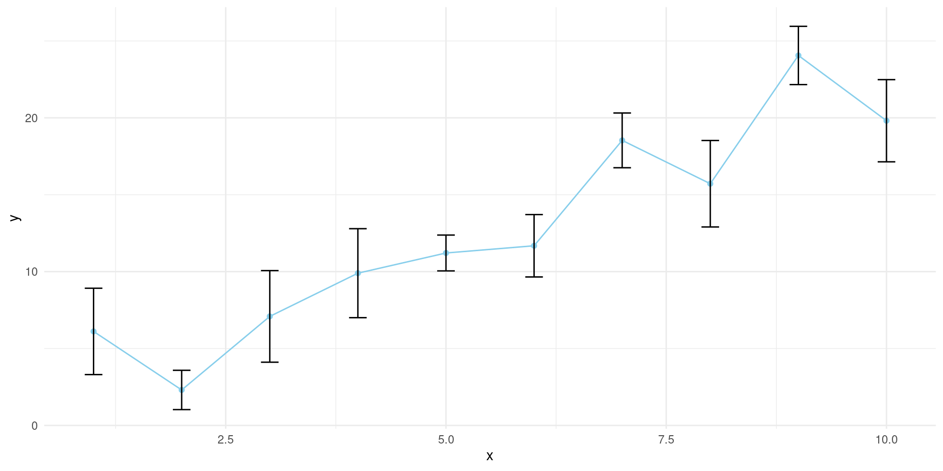
# Example data for trend plot
set.seed(42)
example_data <- data.frame(
  x = 1:10,
  y = 2 * (1:10) + rnorm(10, mean = 0, sd = 3),
  se = runif(10, min = 1, max = 3)
)
# Trend plot with error bars
ggplot(example_data, aes(x = x, y = y)) +
  geom_point(color = "skyblue", linewidth = 3) +
  geom_line(color = "skyblue") +
  geom_errorbar(aes(ymin = y - se, ymax = y + se), width = 0.2) +
  theme_minimal()
Example Visualization 10
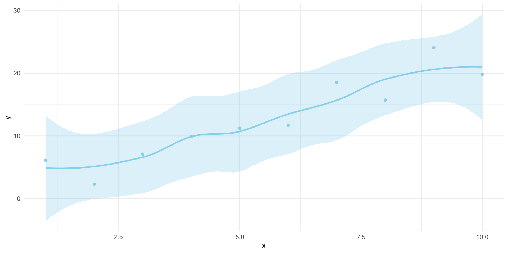
# Uncertainty - Confidence Bands plot
set.seed(42)
example_data <- data.frame(
  x = 1:10,
  y = 2 * (1:10) + rnorm(10, mean = 0, sd = 3),
  se = runif(10, min = 1, max = 3)
)

ggplot(example_data, aes(x = x, y = y)) +
  geom_point(color = "skyblue", linewidth = 3) +
  geom_smooth(method = "loess", se = TRUE,
              color = "skyblue",
              fill = "skyblue", alpha = 0.3) +
  theme_minimal()
Example Visualization 11
Example Visualization 12
![]()
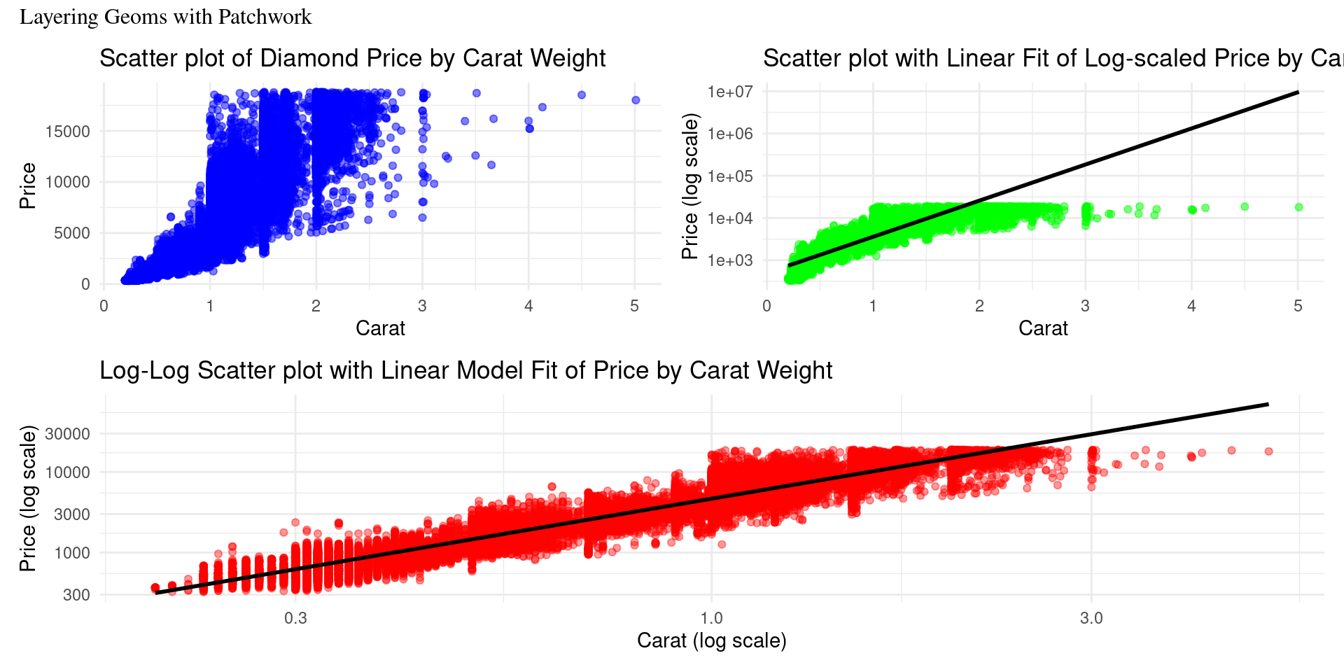
ggplot(data = diamonds, aes(x = carat, y = price)) +
  geom_point(alpha = 0.5, color = "green") +
  geom_smooth(method = "lm", color = "black", size = 1, se = FALSE) +
  scale_y_log10() +
  theme_minimal() +
  labs(x = "Carat", y = "Price (log scale)",
       title = "Scatter plot with Linear Fit of Log-scaled Price by Carat Weight") -> p2
Example Visualization 13
![]()
ggplot(data = diamonds, aes(x = carat, y = price)) +
  geom_point(alpha = 0.4, color = "red") +
  geom_smooth(method = "lm", color = "black", size = 1, se = FALSE) +
  scale_x_log10() + scale_y_log10() +
  theme_minimal() +
  labs(x = "Carat (log scale)", y = "Price (log scale)",
       title = "Log-Log Scatter plot with Linear Model Fit of Price by Carat Weight") -> p3
Example Visualization 14
Group Activity 1

30:00