Advanced Data Visualization Tools
STAT 220
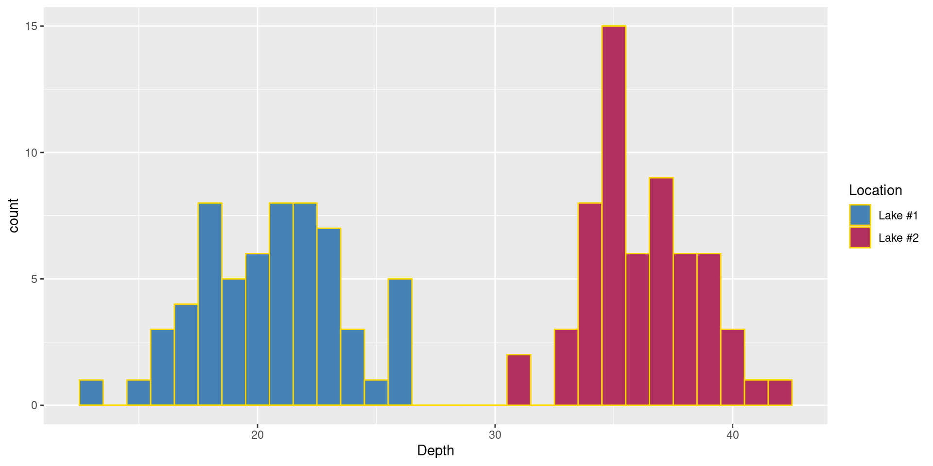
Example
Let’s make Lake #1 steelblue and Lake #2 maroon
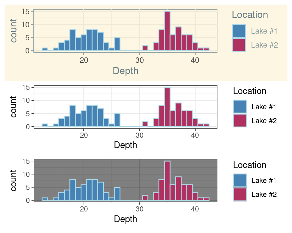
Changing themes
Theme: The non-data ink on your plots
Examples:
- background color
- tick marks
- grid lines
- legend position
- legend appearance
Annotations
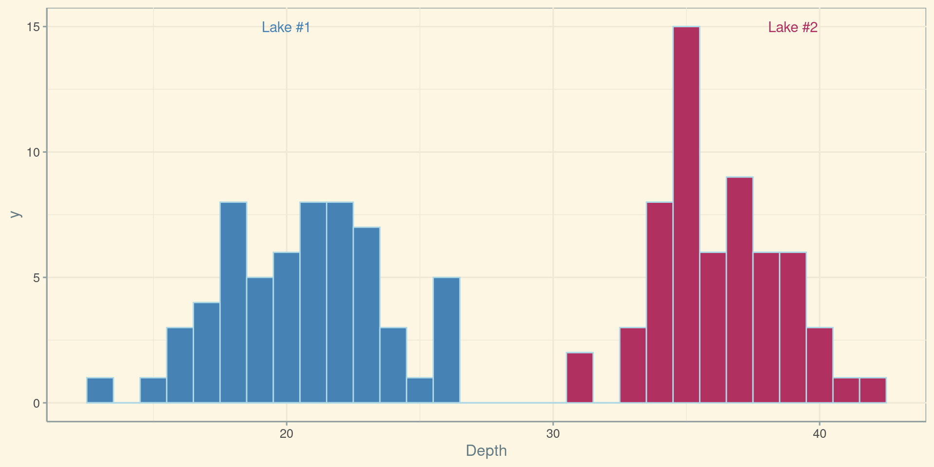
library(ggthemes)
ggplot(data) +
  geom_histogram(
    aes(x = Depth, fill = Location),
    binwidth = 1,
    color = "lightblue") +
    scale_fill_manual(values = c("steelblue", "maroon")) +
    theme_solarized() +
    theme(legend.position = "none") +
    annotate("text", x = 20, y = 15, label = "Lake #1", color = "steelblue") +
annotate("text", x = 39, y = 15, label = "Lake #2", color = "maroon")Polar Coordinates
What is a map?
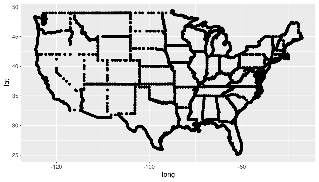
A set of latitude longitude points…
What is a map?
… that are connected with lines in a very specific order.
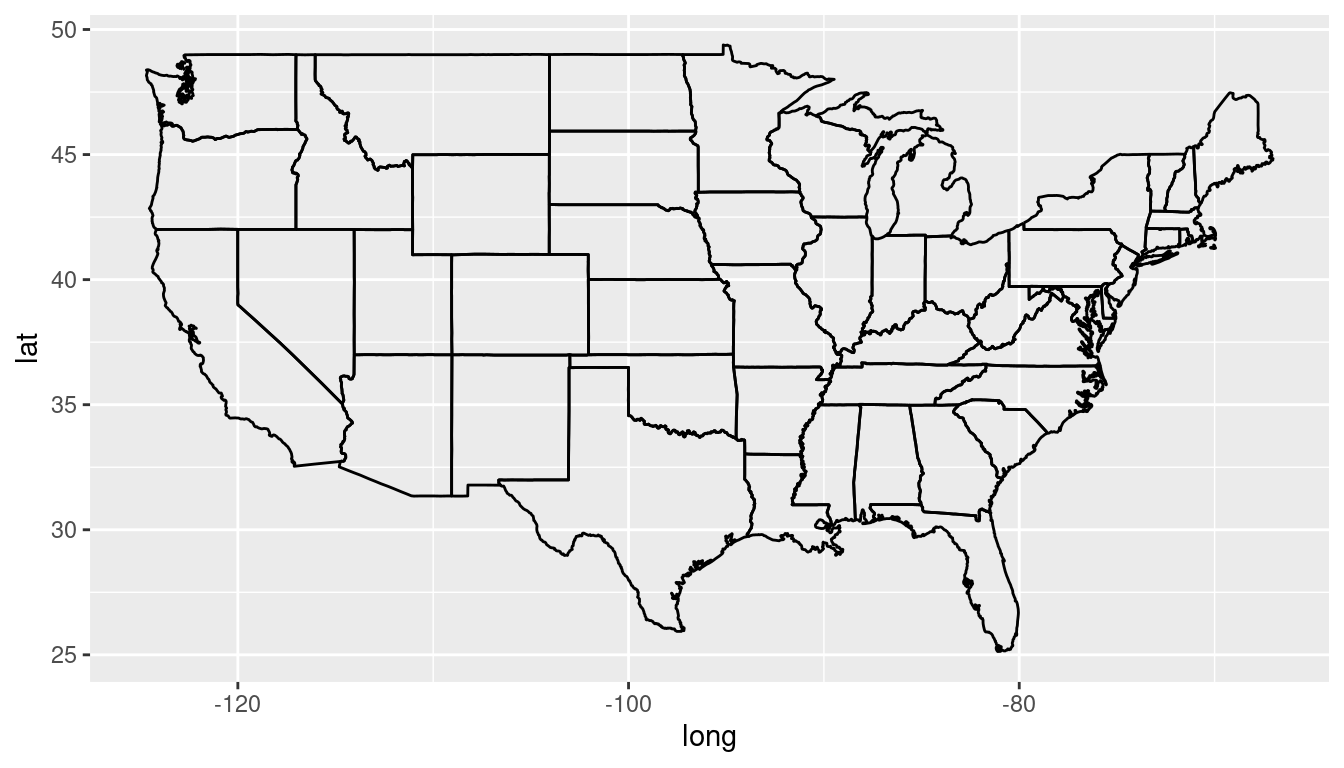
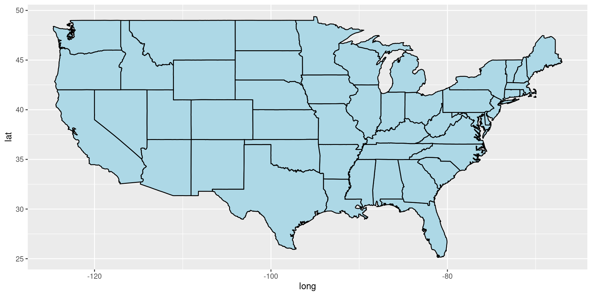
Maps using geom_polygon
geom_polygon connects the dots between lat (y) and long (x) points in a given group. It connects start and end points which allows you to fill a closed polygon shape
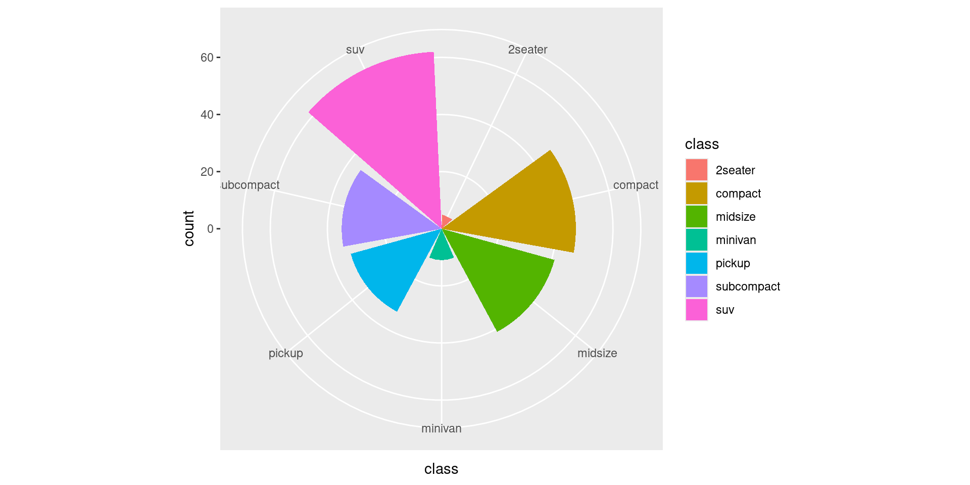
COVID Cases
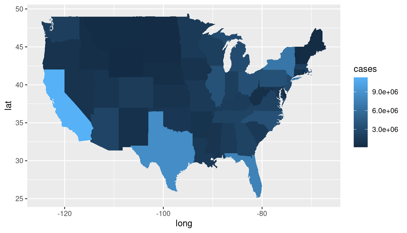
Adjusting the coordinate system
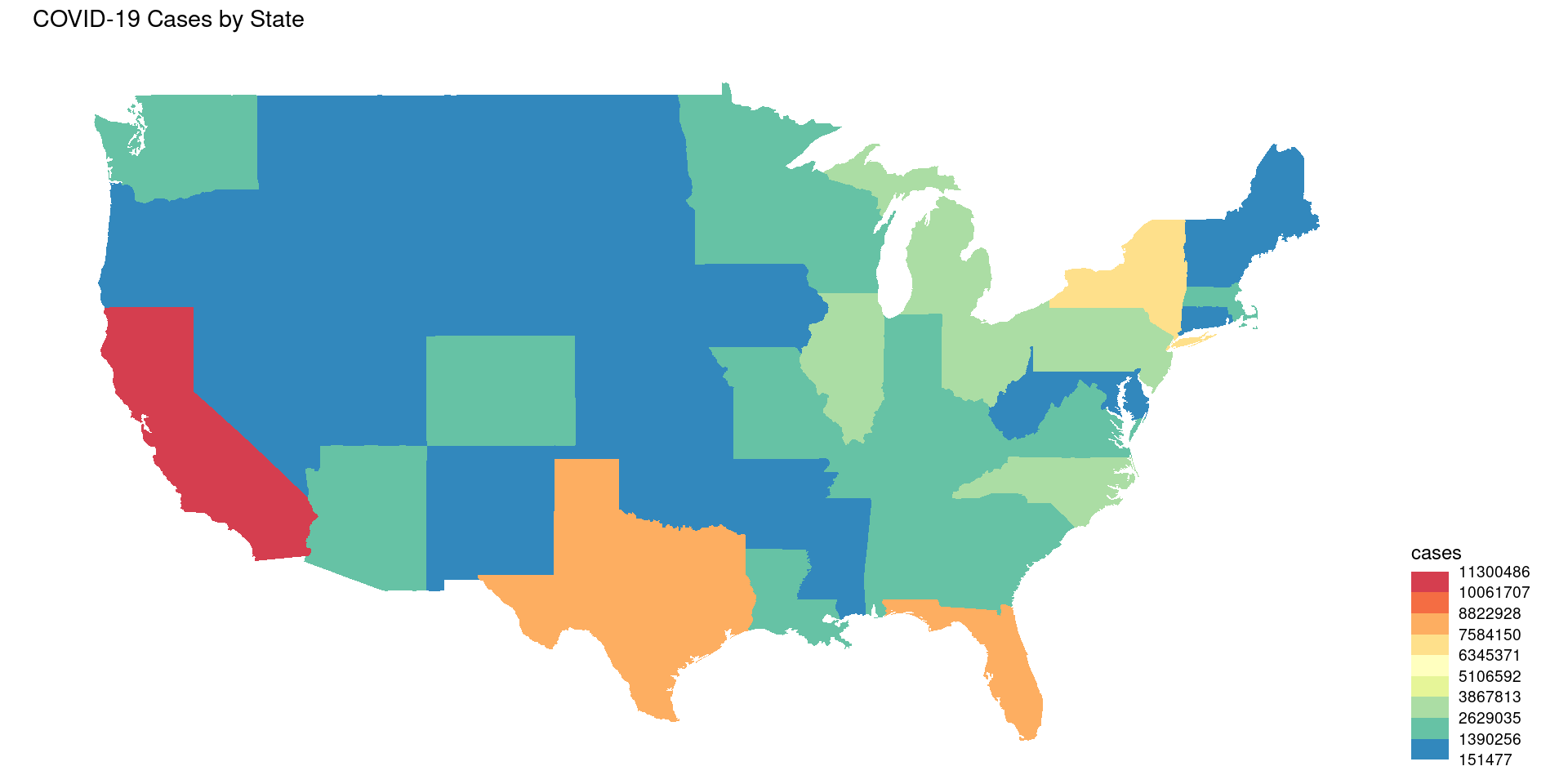
Adjusting the color: alternate way
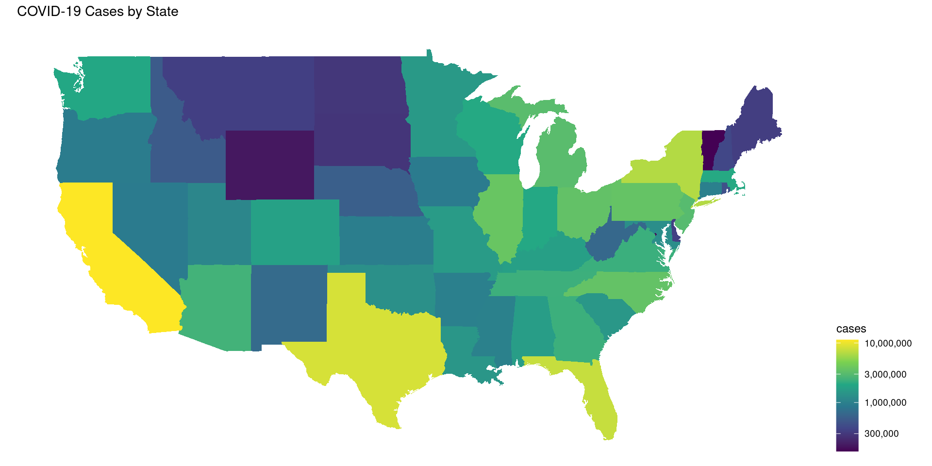
library(viridis)
ggplot(covid_data) +
  geom_polygon(aes(long, lat, group = group, fill = cases)) +
  scale_fill_viridis_c(option = "viridis",
                       trans = "log10",
                       labels = scales::comma,
                       guide = guide_colorbar(title.position = "top")) +
  labs(fill = "cases", title = "COVID-19 Cases by State") +
  coord_map() + theme_map() +
  theme(legend.position="right")
Cloropleth maps using geom_map
Don’t need to merge ACS and states data!
Group Activity 1

30:00