# Load the required libraries
library(tidyverse)
library(ggplot2)
library(datasauRus)Class Activity 4
Your turn 1
This worksheet will guide you through creating various plots using the ggplot2 package in R. We will be using the datasaurus_dozen dataset from the datasauRus package for demonstration purposes. The dataset contains 13 different datasets, and we’ll use them to create a variety of plots.
Scatterplot
- Run the following code.
ggplot(data = dino_data, mapping = aes(x = x, y = y)) +
  geom_point()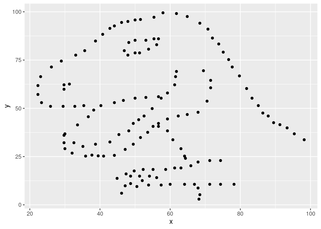
- You must remember to put the aesthetic mappings in the
aes()function! What happens if you forget?
Click for answer
Answer:
If you forget to put the aesthetic mappings inside the aes() function, ggplot2 will not be able to map the variables to the aesthetics correctly, and you might encounter an error or unexpected behavior in your plot.
# Add a layer and see what happens
ggplot(data = dino_data , x = x , y = y)
- The aesthetic mappings can be specified in the geom layer if you prefer, instead of the main
ggplot()call. Give it a try:
Click for answer
Answer:
# Rebuild the scatterplot with your aesthetic mapping in the geom layer
ggplot(data = dino_data) +
geom_point(aes(x = x, y = y)) 
Bar Plot
In this problem, we’ll explore creating a bar plot using the datasaurus_dozen dataset.
- Create a new data frame containing the count of observations in each dataset.
Click for answer
Answer:
dataset_counts <- datasaurus_dozen %>%
  group_by(dataset) %>%
summarise(count = n())- Create a bar plot showing the number of observations in each dataset.
Click for answer
Answer:
ggplot(data = dataset_counts, aes(x = dataset, y = count)) +
  geom_bar(stat = "identity") +
theme(axis.text.x = element_text(angle = 45, hjust = 1)) 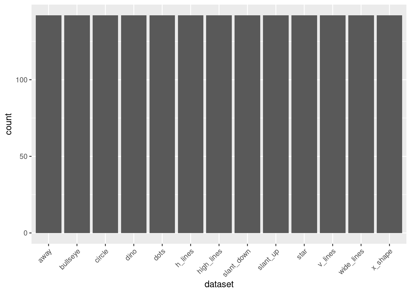
- Generate a bar plot to visualize the median of the
xvariable across different datasets, with error bars denoting the interquartile range (IQR) for each dataset.
Click for answer
Answer:
library(dplyr)
library(ggplot2)

# Calculate median and interquartile range for each dataset
dataset_summary <- datasaurus_dozen %>%
  group_by(dataset) %>%
  summarise(median_x = median(x), iqr_x = IQR(x))

# Create a bar plot with error bars representing the IQR
ggplot(dataset_summary, aes(x = dataset, y = median_x)) +
  geom_bar(stat = "identity", fill = "turquoise") +
  geom_errorbar(aes(ymin = median_x - iqr_x/2, ymax = median_x + iqr_x/2), width = 0.2) +
  theme(axis.text.x = element_text(angle = 45, hjust = 1)) +
  labs(title = "Median of x by Dataset with IQR Error Bars", x = "Dataset", y = "Median of x")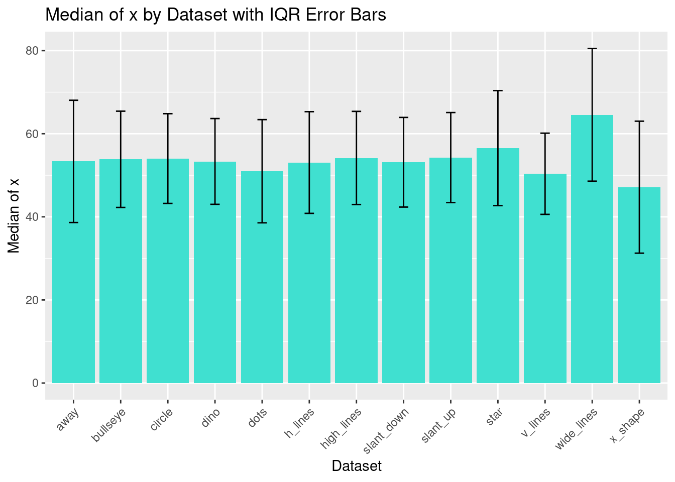
Histogram
- Create a histogram of the
xvariable for thedinodataset.
Click for answer
Answer:
ggplot(data = dino_data, aes(x = x)) +
geom_histogram(binwidth = 3) 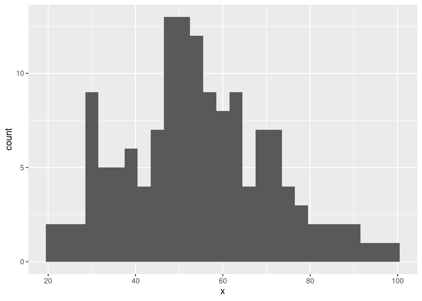
- Overlay a density curve on the histogram.
Click for answer
Answer:
ggplot(data = dino_data, aes(x = x)) +
  geom_histogram(aes(y = after_stat(density)), binwidth = 2, fill = "lightblue") +
  geom_density(color = "red")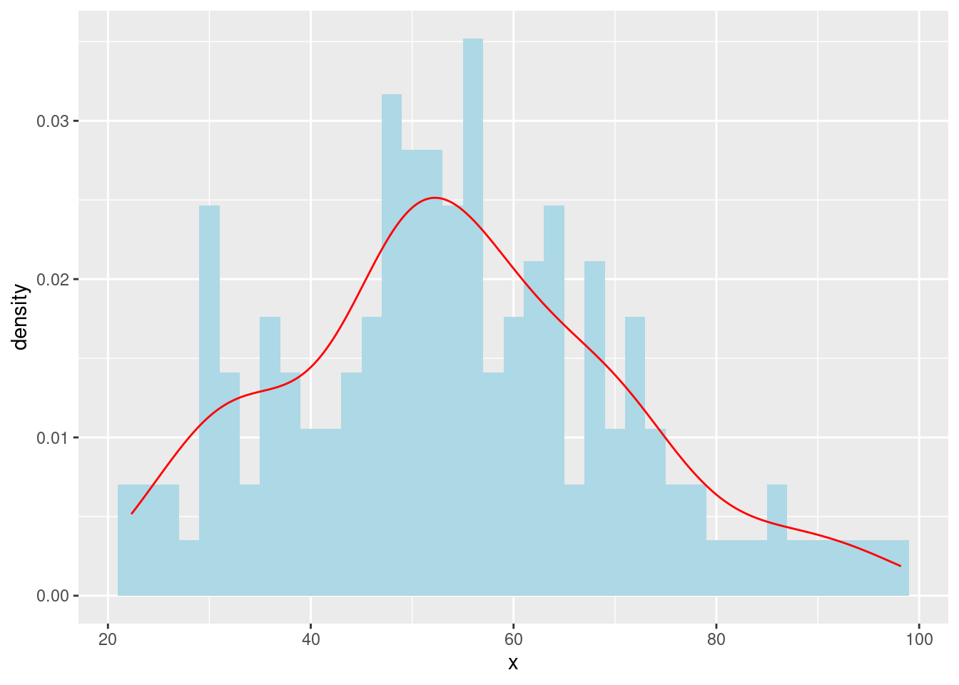
Boxplot
- Create a boxplot of the x variable for each dataset in datasaurus_dozen.
Click for answer
Answer:
ggplot(data = datasaurus_dozen, aes(x = dataset, y = x)) +
  geom_boxplot() +
  theme(axis.text.x = element_text(angle = 45, hjust = 1))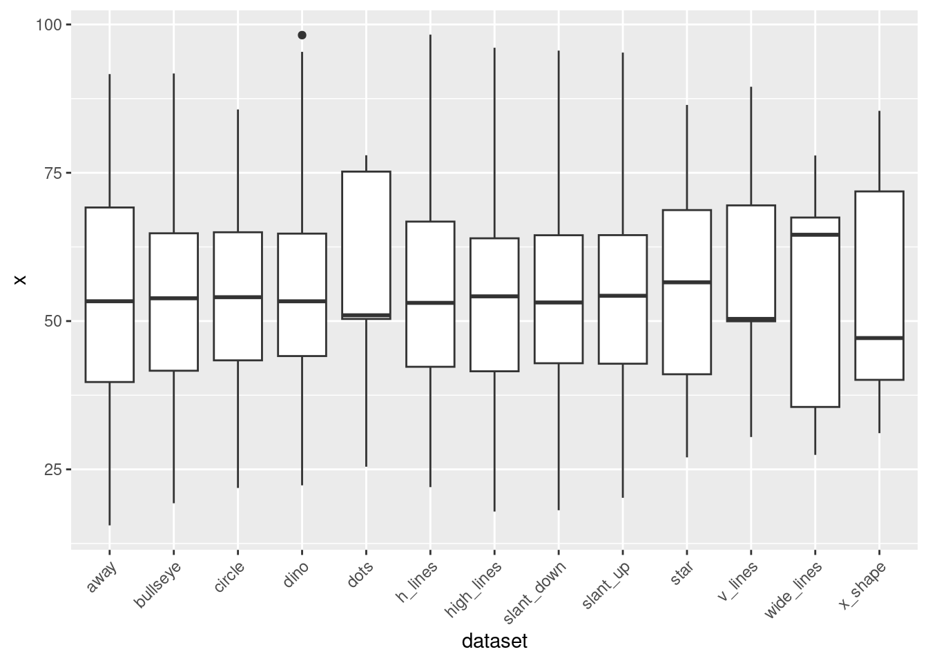
Faceting
Click for answer
Answer:
- Create a scatterplot of
xvs.yfor each dataset indatasaurus_dozenusingfacet_wrap().
ggplot(data = datasaurus_dozen, aes(x = x, y = y)) +
  geom_point() +
  facet_wrap(~ dataset) +
  theme_minimal()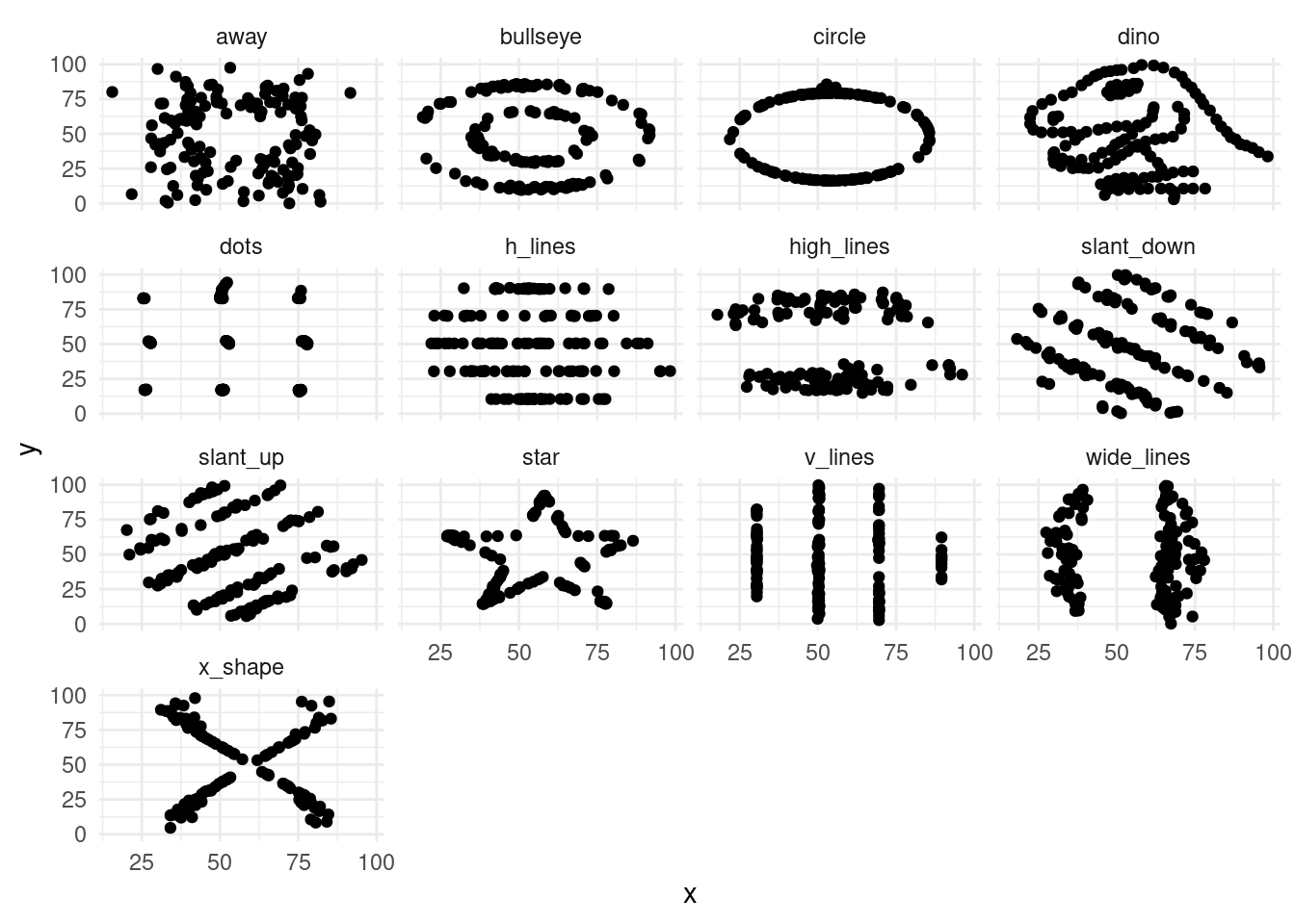
Variable Transformation
- The scatterplot of the
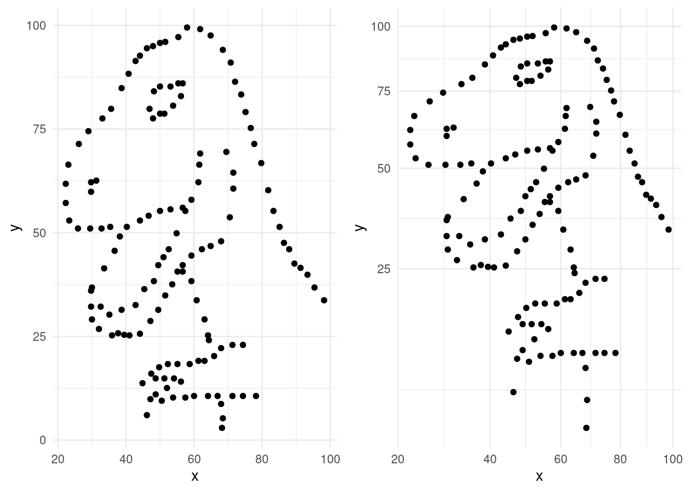
dinodataset without any transformations is given below. Complete the code and store the plot in an object calledp1.
Click for answer
Answer:
ggplot(data = dino_data, aes(x = x, y = y)) +
  geom_point() +
theme_minimal() -> p1- Now, apply the square root transformation to both the
xandyaxes using thescale_x_sqrt()andscale_y_sqrt()functions in thedinodataset. Complete the code and store the plot in an object calledp2.
Click for answer
Answer:
ggplot(data = dino_data, aes(x = x, y = y)) +
  geom_point() +
  scale_x_sqrt() +
  scale_y_sqrt() +
theme_minimal() -> p2- Use
plot_layout()andplot_annotationfunctions frompatchworkpackage to plot the above two plots side-by-side.
Click for answer
library(patchwork)
combined_plot <- p1 + p2
combined_plot +
  plot_layout(ncol = 2) +
  plot_annotation(title = "Layering Geoms with Patchwork")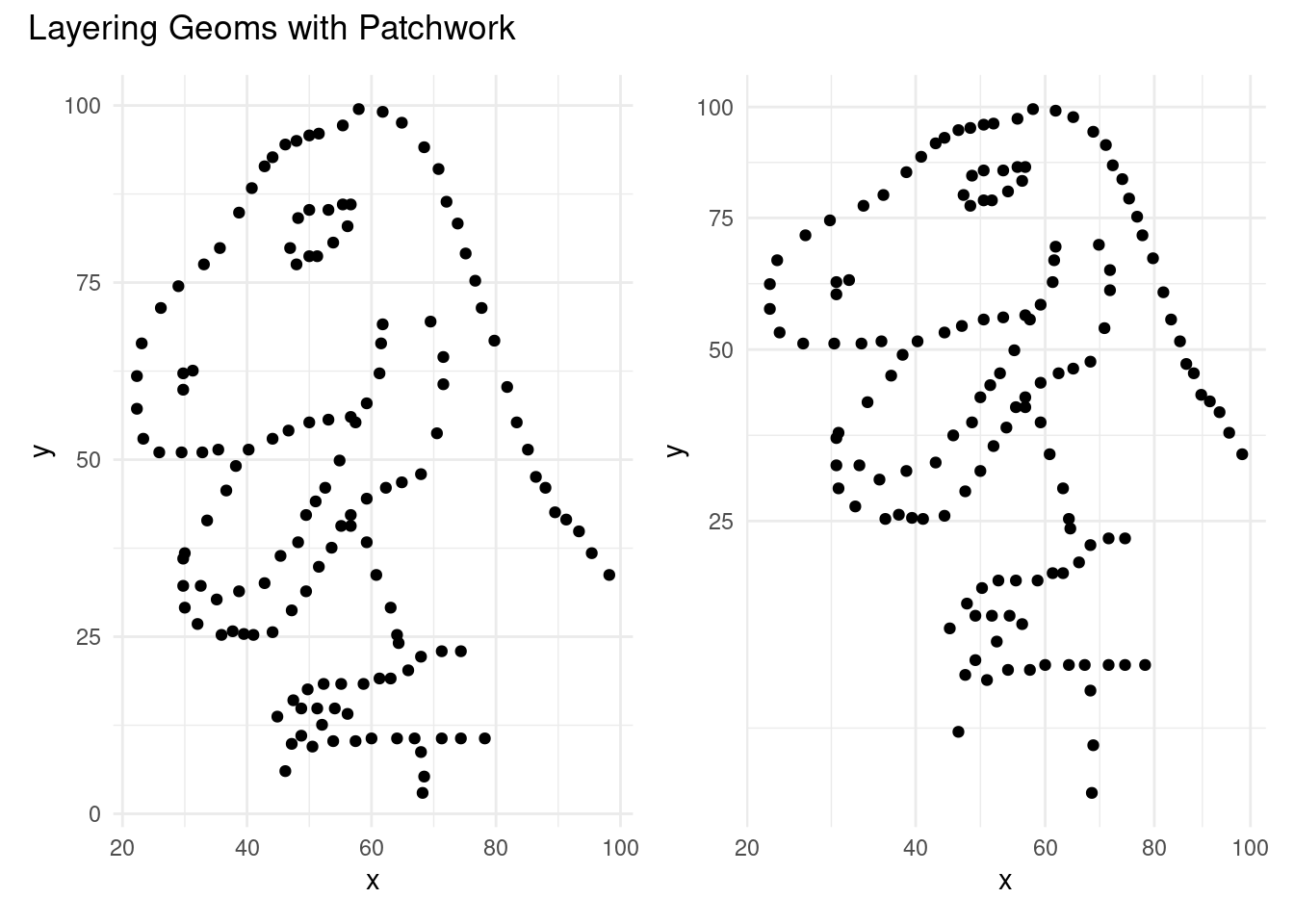
- Use
grid.arrange()function fromgridExtrapackage to get similar results as in part c.
Click for answer
Answer:
library(gridExtra)
grid.arrange(p1, p2, ncol = 2)