# Load the required libraries
library(tidyverse)
library(ggplot2)
library(ggthemes)Class Activity 5
Problem 1: Changing color and shape scales
In this problem, you will learn about the effects of changing colors, scales, and shapes in ggplot2 for both gradient and discrete color choices. You will be given a series of questions and examples to enhance your understanding. Consider the following scatter plot
# Generate sample data
set.seed(42)
data <- data.frame(
  Category = factor(sample(1:3, 50, replace = TRUE), labels = c("A", "B", "C")),
  X = 10 ^ rnorm(50, mean = 2, sd = 1),
  Y = rnorm(50, mean = 0, sd = 1)
)

p <- ggplot(data, aes(x = X, y = Y, color = Category)) +
  geom_point(size = 3)

p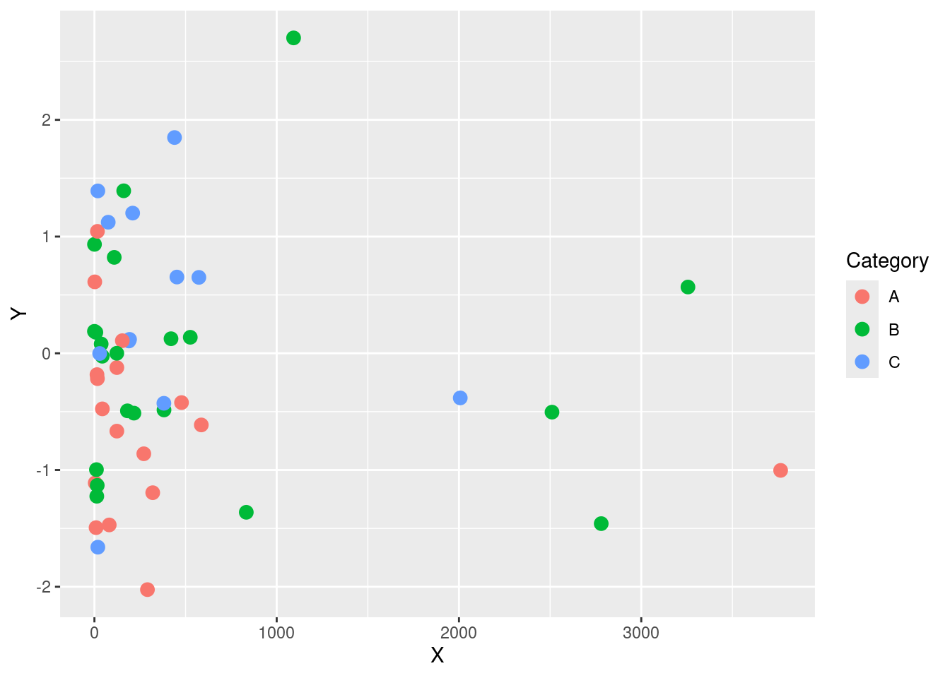
- Modify the scatter plot to use custom colors for each category using
scale_color_manual(). What is the effect of changing the colors on the plot’s readability?
Click for answer
Answer: Changing colors using scale_color_manual() allows for better distinction between categories and enhances the plot’s readability.
p <- ggplot(data, aes(x = X, y = Y, color = Category)) +
  geom_point(size = 3) +
  scale_color_manual(values = c("red", "blue", "green"))
p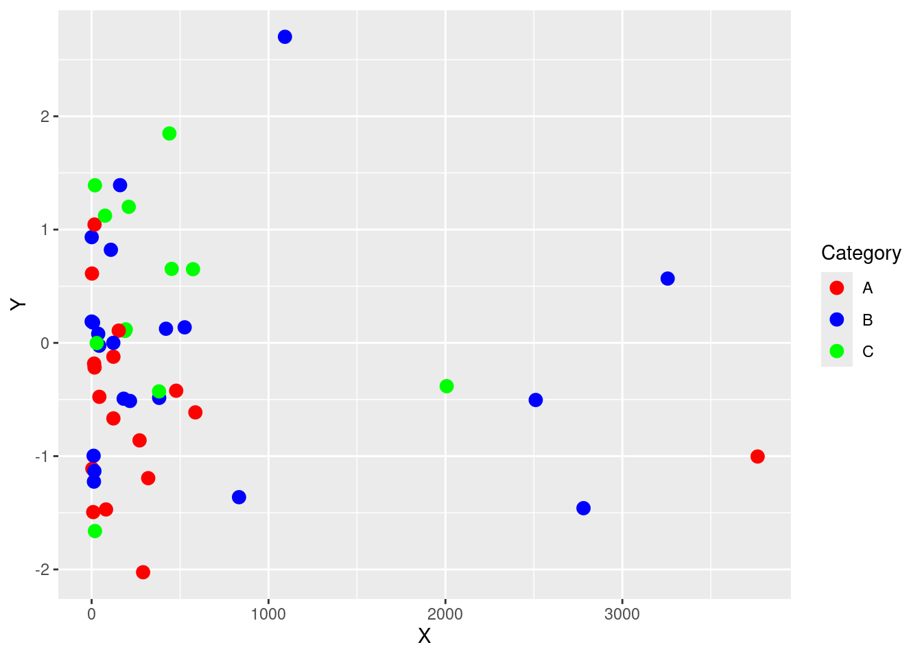
- Modify the scatter plot to use custom shapes for each category using
scale_shape_manual(). What is the effect of changing the shapes on the plot’s readability?
Click for answer
Answer: Changing the shapes using scale_shape_manual() helps to distinguish between categories and improves the plot’s readability
p <- ggplot(data, aes(x = X, y = Y, shape = Category,  color = Category)) +
  geom_point(size = 3) +
  scale_shape_manual(values = c("A" = 16, "B" = 17, "C" = 18)) +
  scale_color_manual(values = c("A" = "red", "B" = "blue", "C" = "green"))

p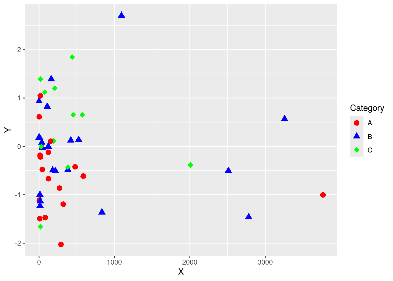
- Try modifying the plot by combining color, shape, and theme customizations. Additionally, try using
geom_smooth()to add trend lines for each category. Pay attention to how each element affects the overall readability and interpretability of the plot.
Click for answer
Answer:
p <- ggplot(data, aes(x = X, y = Y)) +
  geom_point(aes(color = Category, shape = Category), size = 3) +
  geom_smooth(aes(group = Category, color = Category), method = "lm", se = FALSE) +
  scale_shape_manual(values = c("A" = 19, "B" = 8, "C" = 24)) +
  scale_color_brewer(palette = "Dark2") +
  ggthemes::theme_tufte() +
  labs(title = "Separate Trend Lines for Each Category")

p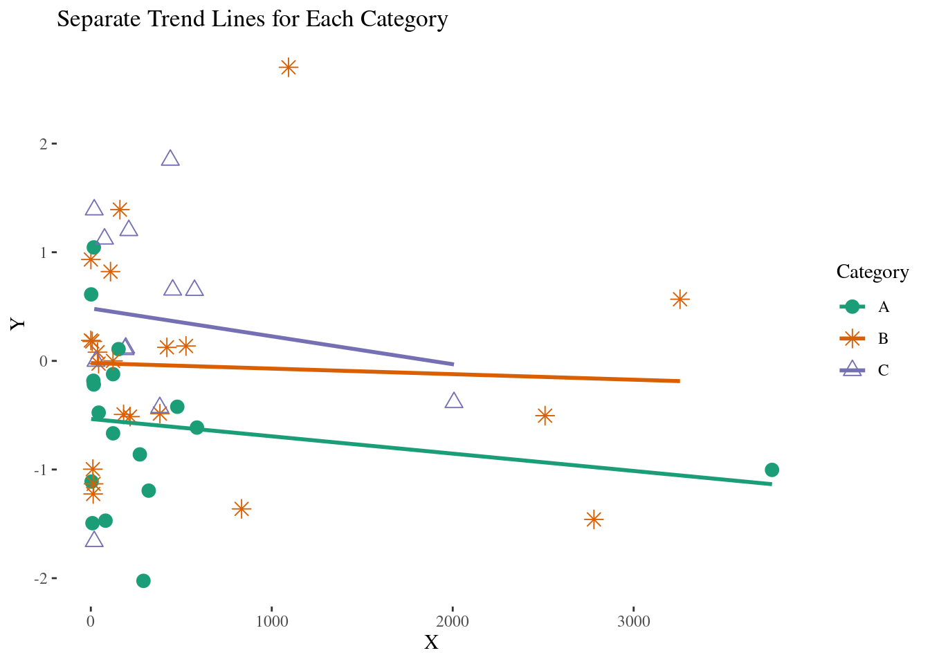
Problem 2: Chloropeth map
In today’s class we created cloropleth maps of states in the US based on ACS data.
states <- map_data("state")
ACS <- ACS <- read.csv("https://raw.githubusercontent.com/deepbas/statdatasets/main/ACS.csv")
ACS <- dplyr::filter(ACS, !(region  %in% c("Alaska", "Hawaii"))) # only 48+D.C.
ACS$region <- tolower(ACS$region)  # lower case (match states regions)
(a) Mapping median income
Create a cloropleth plot that uses color to create a MedianIncome map of the US.
Click for answer
Answer:
# map median income
ggplot(data=ACS) + coord_map() +
  geom_map(aes(map_id = region, fill = MedianIncome), map = states) +
  expand_limits(x=states$long, y=states$lat) + ggtitle("Median Income")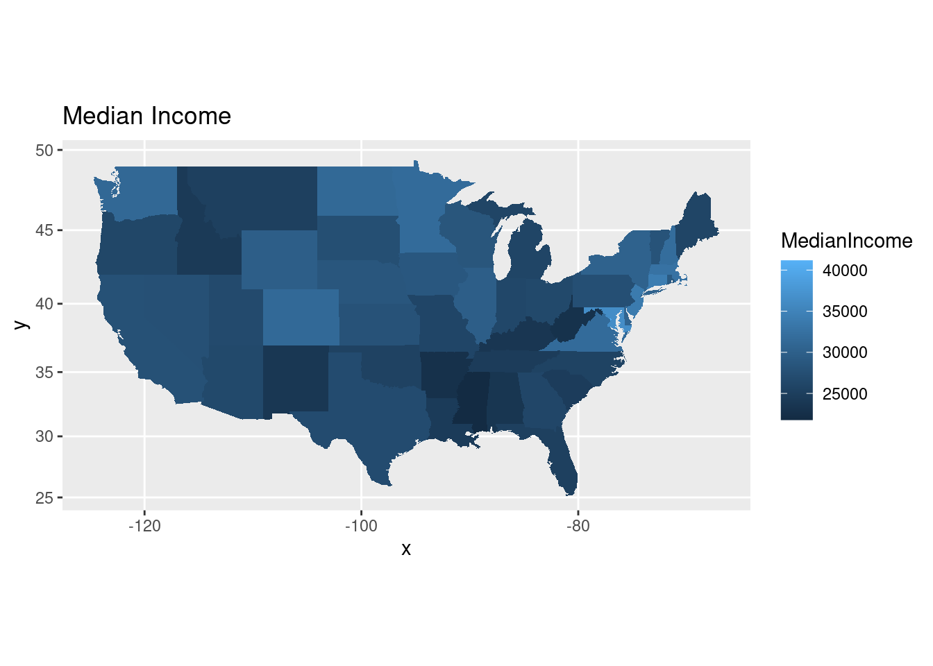
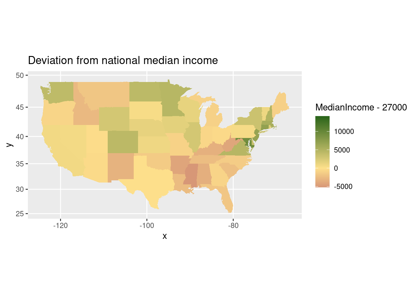
(b) Mapping deviations from national median income
The median income in the US in 2016 was estimated to be $27,000. Redraw your map in (a) to visualize each state’s deviation from national median income.
Click for answer
Answer:
# compare state income to national income
ggplot(data=ACS) + coord_map() +
  geom_map(aes(map_id = region, fill = MedianIncome - 27000), map = states) +
  expand_limits(x=states$long, y=states$lat) + ggtitle("Deviation from national median income")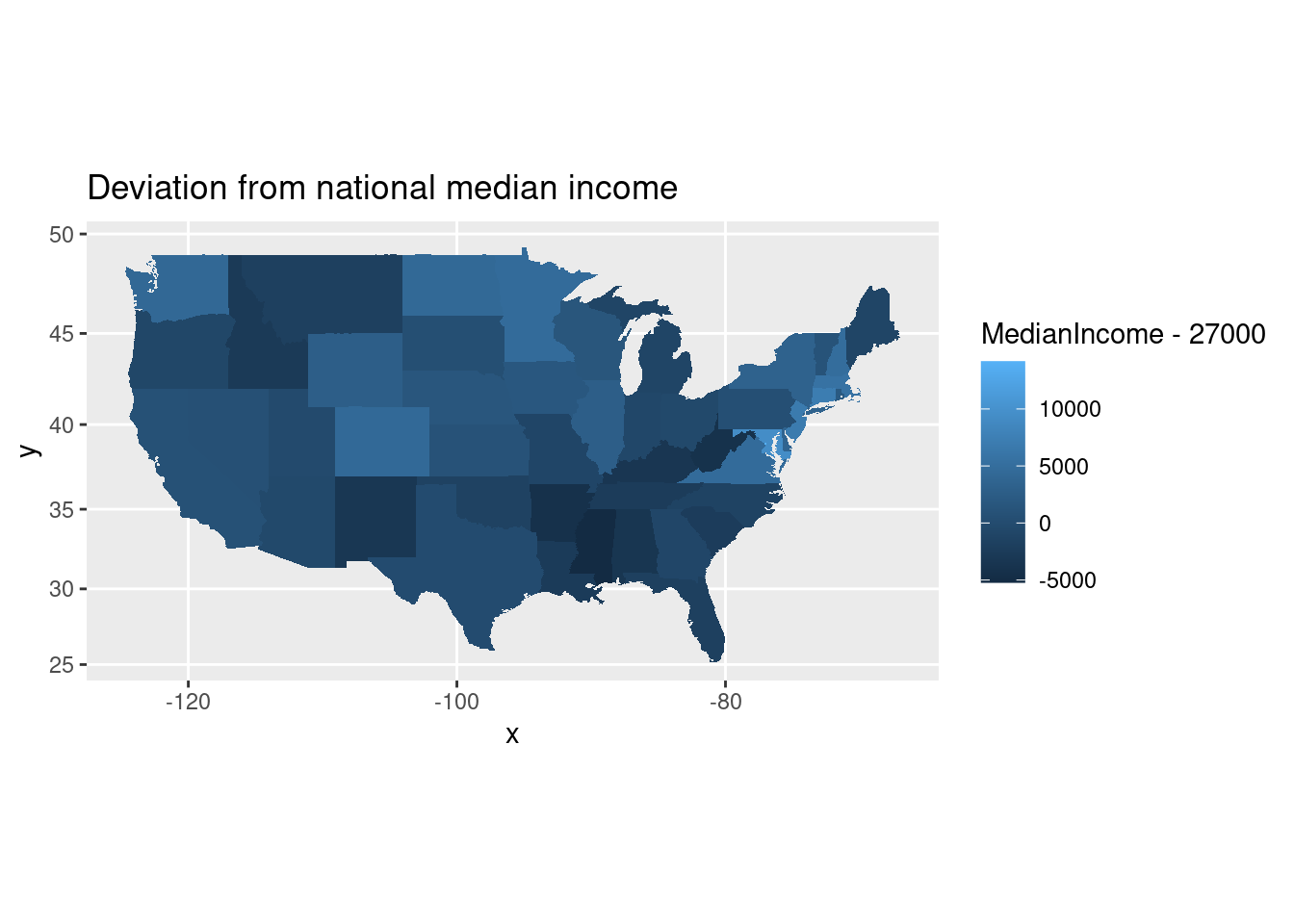
(c) Changing numerically scaled color
You should use a diverging color for (b) to highlight larger deviations from the national median. Add scale_fill_distiller to the map from (b) and select a diverging palette.
Click for answer
Answer:
# change to a diverging color
ggplot(data=ACS) + coord_map() +
  geom_map(aes(map_id = region, fill = MedianIncome - 27000), map = states) +
  expand_limits(x=states$long, y=states$lat) + ggtitle("Deviation from national median income") +
  scale_fill_distiller(type = "div")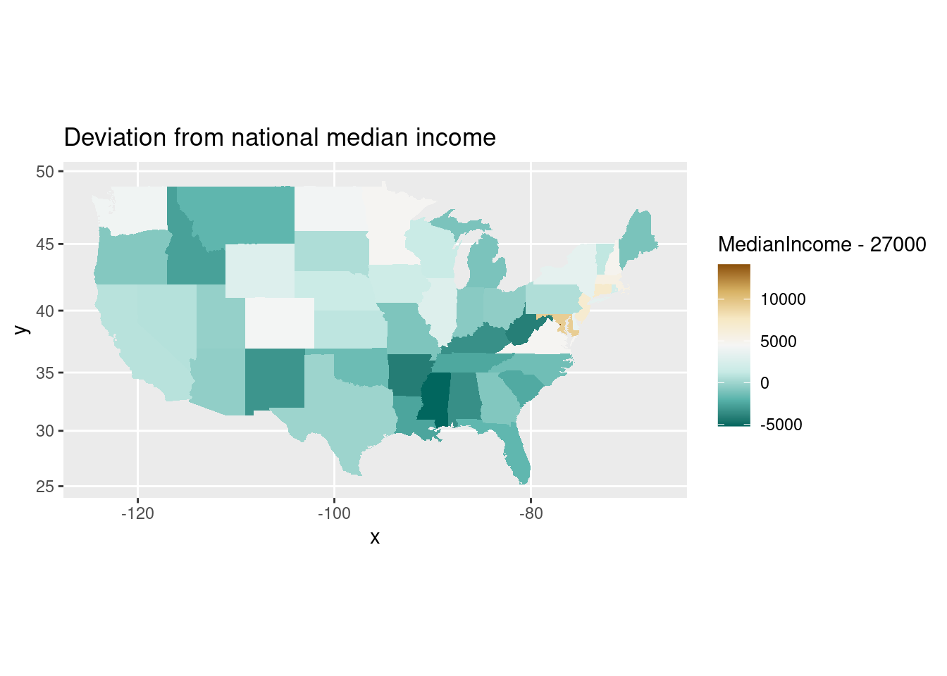
(d) Fixing a midpoint on a diverging scale
Use scale_fill_gradient2 to fix a midpoint scale value at white color, with diverging colors for larger positive and negative values. Apply these colors to your map in (b) and fix the midpoint at an appropriate value.
Click for answer
Answer:
# change to a gradient fill color
ggplot(data=ACS) + coord_map() +
  geom_map(aes(map_id = region, fill = MedianIncome - 27000), map = states) +
  expand_limits(x=states$long, y=states$lat) + ggtitle("Deviation from national median income") +
  scale_fill_gradient2(
    low = "#8e0152",    # Set the low color to red
    mid = "#fee08b", # Set the mid color to yellow
    high = "#276419", # Set the high color to green
    midpoint = 0
  )
(e) Polygon map
# Merge income data with geographic information
income_data <- left_join(states, ACS, by = c("region" = "region"))
For this task, you will create a polygon map to visualize the MedianIncome across different states. Pay attention to the shapes and sizes of states as depicted on the map.
Click for answer
ggplot(data = income_data) +
  geom_polygon(aes(x = long, y = lat, group = group, fill = MedianIncome),
               color = "white", size = 0.2) +
  labs(fill = "Median Income", title = "Median Income by State") +
  theme_minimal() + coord_map() +
  scale_fill_viridis_c()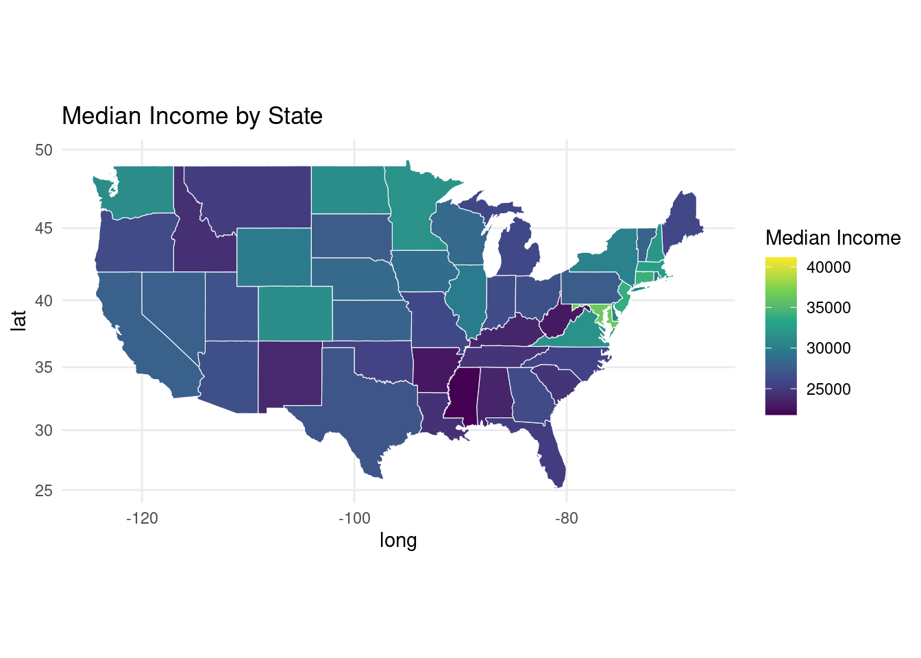
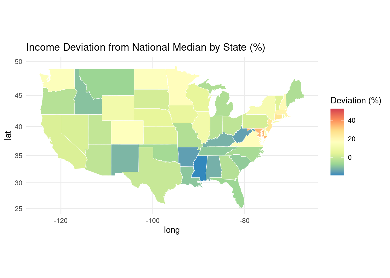
(f) Visualizing Relative Income Deviation
Click for answer
# Calculate income deviation as a percentage
national_median <- 27000

# Merge the updated income data with geographic information
ACS$IncomeDeviationPercent <- ((ACS$MedianIncome - national_median) / national_median) * 100
income_data <- left_join(states, ACS, by = c("region" = "region"))

# Plot the income deviation using Robinson projection with geom_polygon
ggplot(data = income_data) +
  geom_polygon(aes(x = long, y = lat, group = group, fill = IncomeDeviationPercent),
               color = "white", size = 0.2) +
  labs(fill = "Income Deviation (%)", title = "Income Deviation from National Median by State (%)") +
  theme_minimal() + coord_map() +
  scale_fill_distiller(palette = "Spectral", name = "Deviation (%)")